APN Chora: A sans serif with subtle glyphic inflection and humanist modulation for display and brand identity.
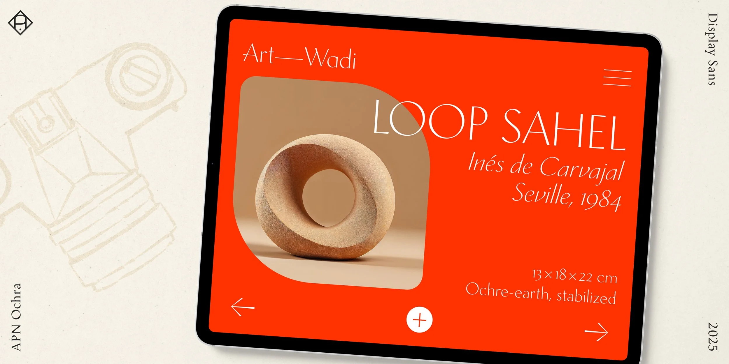
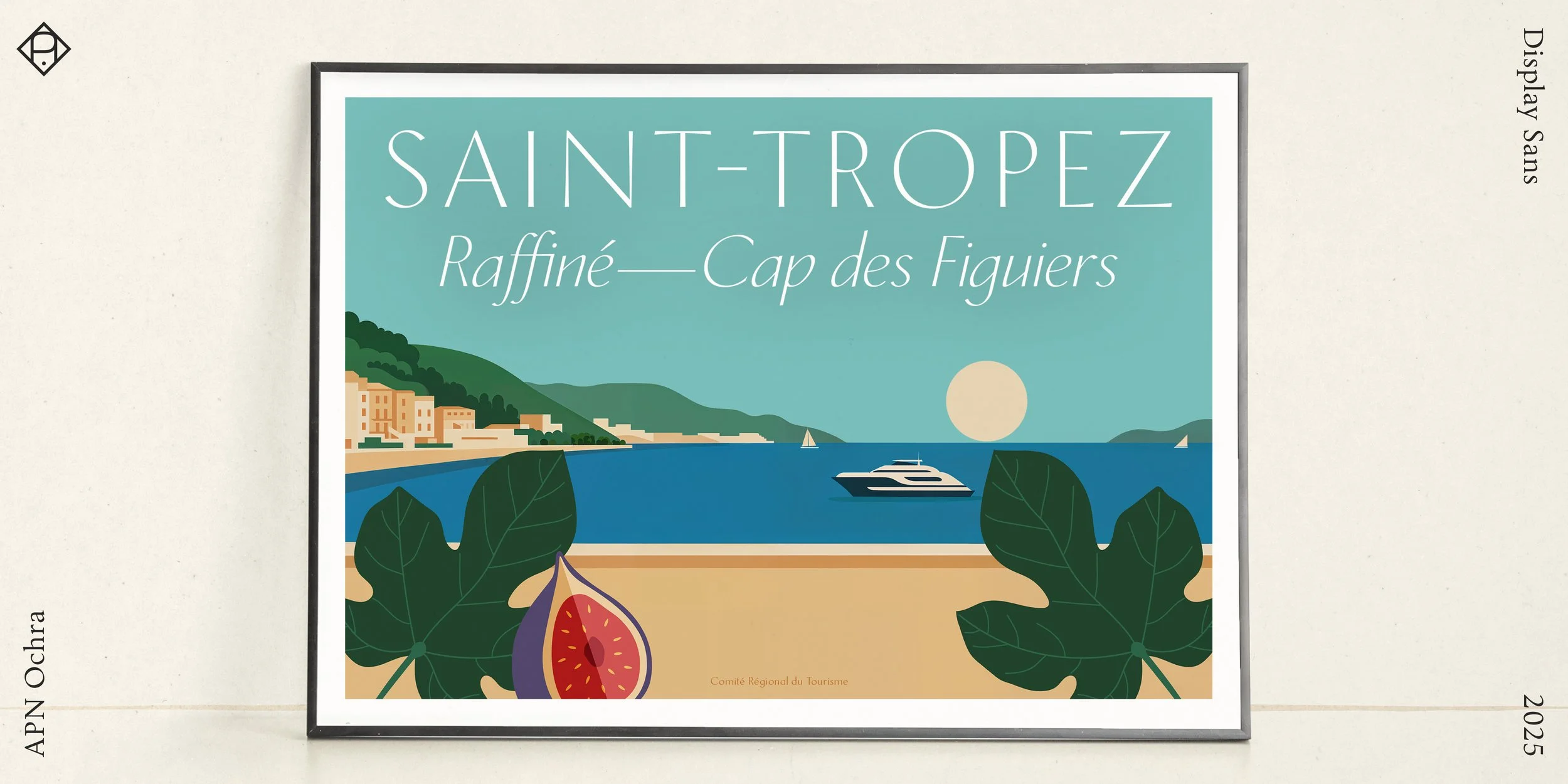
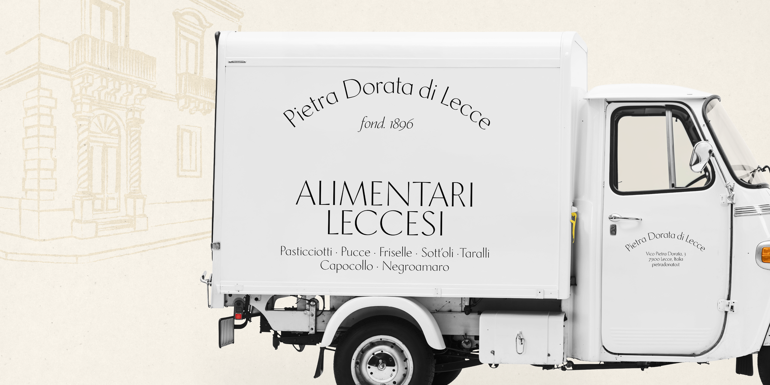
Introducing APN Ochra: a slender, sun-baked display and titling companion to APN Chora, with a subtle glyphic touch and a nod to earlier Quattrocento Florentine letterforms, illustrating the cyclical nature of cultural revivals.
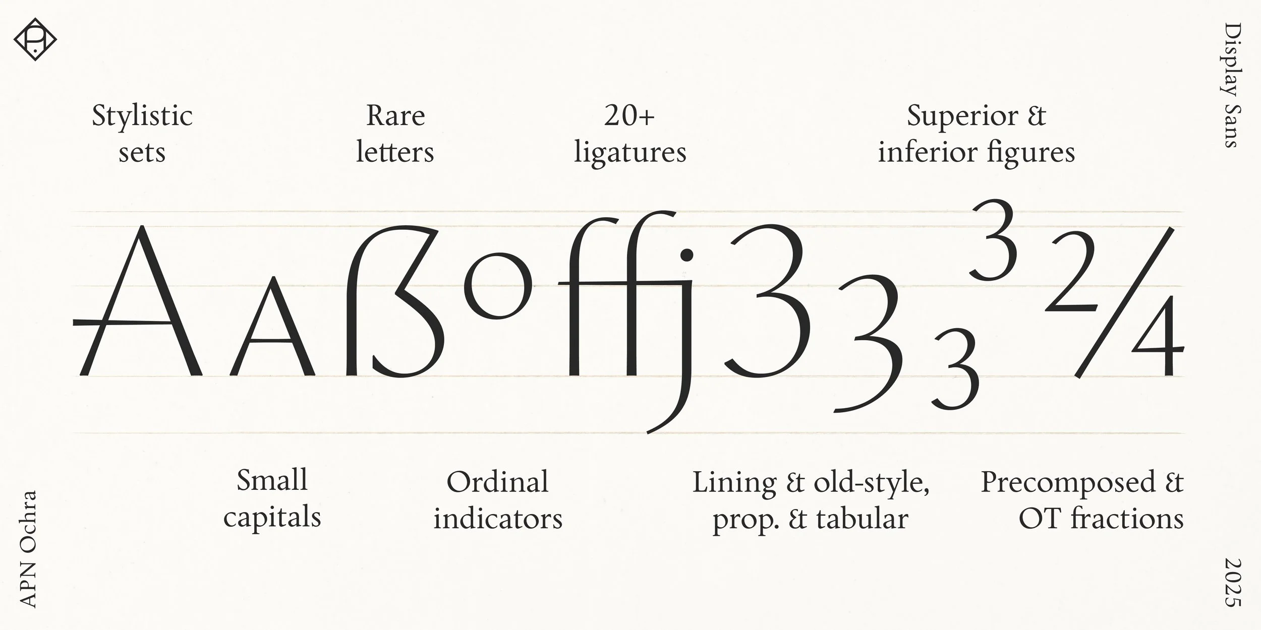
Modulated rather than monolinear, APN Ochra marries inscriptional traits with the broad-nib logic and pronounced diagonal stress of APN Chora. A lowered x-height permits generous ascenders, while subtle irregularities lend natural elegance. The capitals echo imperial Roman proportions, while the lowercase draws from open, rounded Renaissance forms, and the italic employs a bi-angular slant for gentle dynamism.
Though conceived for titling and display, APN Ochra is fully equipped for versatility: it includes lowercase, small caps, multiple figure sets, fractions, stylistic sets and alternates, fine ligatures, case-sensitive forms, mathematical symbols, and more—all with extensive Latin-script language support.
APN Ochra’s distinctive, expressive voice brings clarity, contrast, and grace to headlines, logomarks, and identity work, extending the APN Chora family while remaining true to its principles.
Concept
Research
Type design